TechPOS
brand identity, design system, and POS interface for a retail technology brand.


About the project
I worked closely with the TechPOS team to revamp their brand identity by creating a brand guide that outlines a consistent visual framework for growth. TechPOS is dedicated to developing a seamless all-in-one retail ecosystem for the cannabis industry.

The Challenge
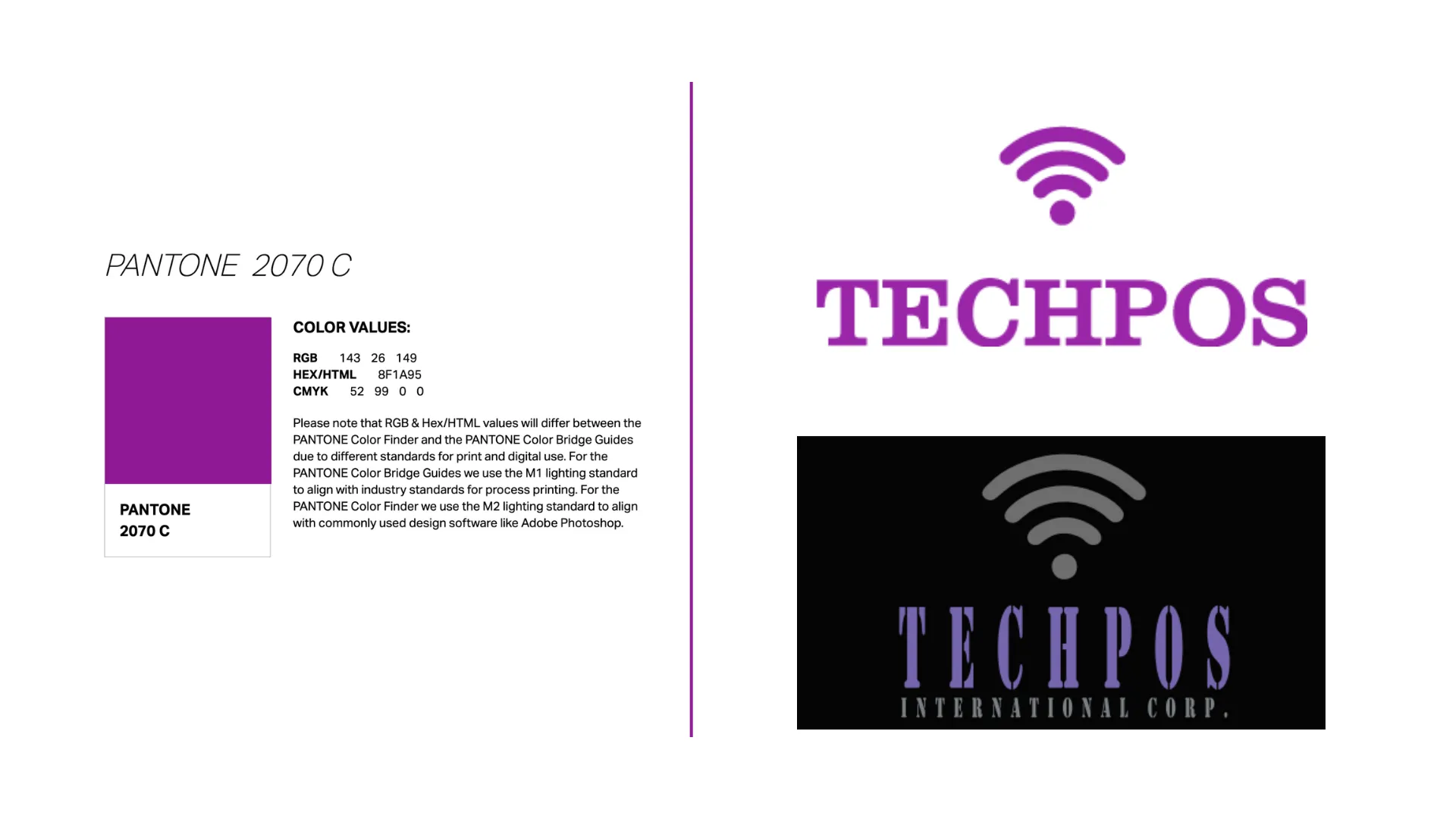
TechPOS had no brand guidelines or design system. Its logo did not represent the core brand, and its users said the POS interface fell short of its competitors.
The Approach
Brand identity: I took the logo’s direction from AI-driven systems and microchips, to signal that TechPOS is a technology company.
Brand guide and design system: I wrote the brand guide to cover logo use, colour schemes, typography, and iconography, so every asset and screen follows the same rules.
The New Logo

Circuit-like lines and connectors represent the POS system linking the machine and customers, and the mark is meant to convey trust and innovation.

Colour Palette

Typography

POS interface
I redesigned the plain, Microsoft-style POS interface using those standards: a unified colour scheme, typography, and iconography applied across 10+ screens.


